Simply Keto, November 2017
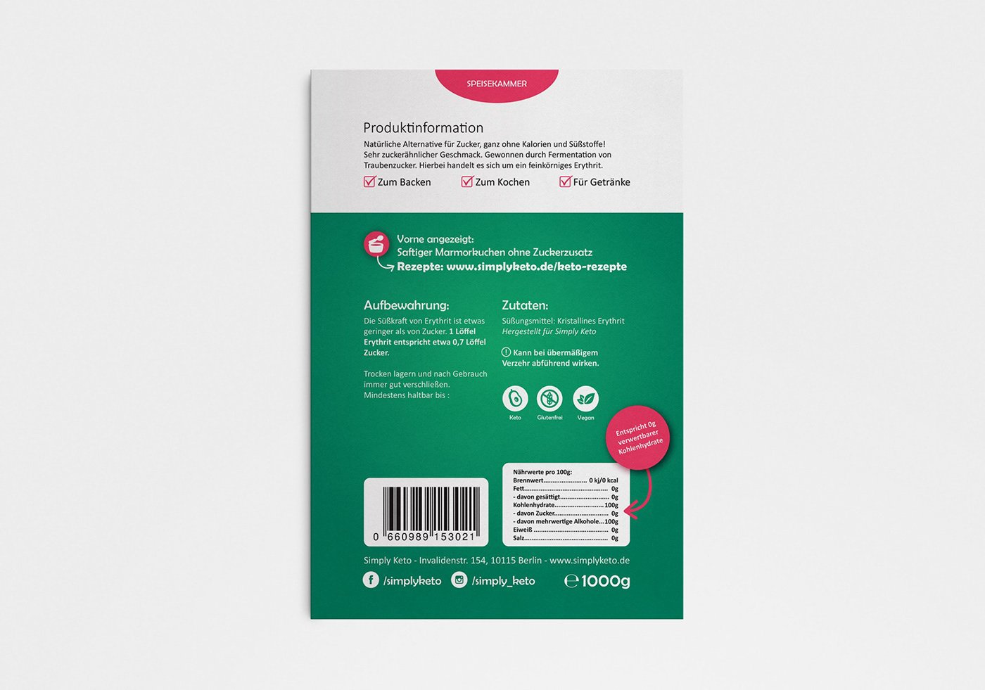
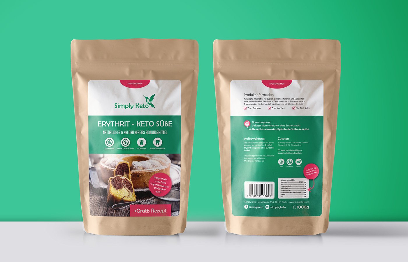
Simply Keto is a unique shop and café in Berlin, Germany that caters to customers who follow a ketogenic (LCHF) diet. They offer a wide variety of homemade baked goods, kitchen ingredients, and condiments. When Simply Keto decided to launch a new line of kitchen ingredients, naturally the first product had to be most keto dieters’ sweetener of choice: erythritol. In approaching this project, I sought to bring out a more polished look compared to Simply Keto’s past lines. Not only did I slightly rework their logo, but I also updated their icons, typography, and use of photography.
This packaging/labeling project began with a short case study of competitors’ erythritol packaging, as well as the packaging of other health oriented brands. We then constructed a very basic layout, without any details or final copy. This was to ensure that the layout had balance purely on its own. Only when we were satisfied with this wireframe did we use it as a template. Of course, the final layout did end up changing due to fine tuning towards the end of the project, but only in order to communicate more vital information like the “Free Recipe” tag on the front.
Eventually this packaging layout was expanded to several other products.